
A Detour to Fulfillment
The collaboration and interactive maps for IMF’s Lending Commitment
The International Monetary Fund (IMF) is a global organization that works to achieve sustainable growth and prosperity for all of its 190 member countries. It does so by supporting economic policies that promote financial stability and monetary cooperation, which are essential to increase productivity, job creation, and economic well-being. The IMF is governed by, and accountable to, its member countries.
Collaborator
Hangjie Cai
Yichen Xu
This project is an opportunity to use data visualisation to tell the Fund’s story to its 190 member countries and other stakeholders. The aim is to highlight and celebrate its work on the 80th anniversary of the Bretton Woods Conference that established the IMF.
Two outputs to be delivered:
Output one: One data visualization which should be used in the IMF’s reports, presentations and internal and external communications.
Output two: One site-specific installation proposal.
This is a three members collaboration work. Despite my eight years of experience working in a collaborative environment, I have always harbored skepticism toward collaboration, believing it hindered progress and impeded alignment on goals and ideas.
Typically, in my role as the sole designer focused on product design, I collaborated cross-functionally with product managers, developers, and various other stakeholders. However, collaboration specifically within the design work is a new experience for me, intensifying my skepticism as I am uncertain about what to expect.
During the ideation stage, we worked independently with extensive online communication, resulting in additional collective time invested for sync and alignment. However, based on my experience, this extended duration contributed to a more favorable outcome.
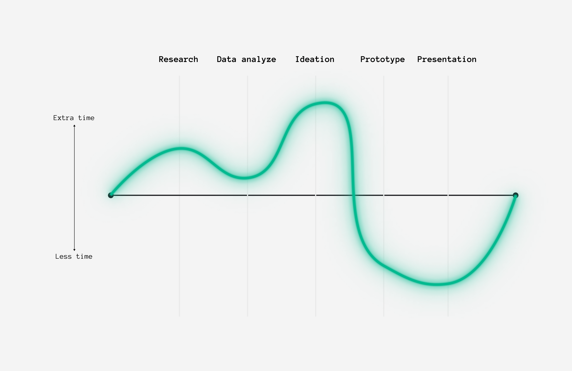
I depict the collaboration experience not only through communication styles but also by breaking down design process stages. I provide a rough estimate for each stage if I had worked on this project individually, allowing for a comparison with the collaborative approach. The visualization below indicates whether each task requires additional or less time in team collaboration.
Nevertheless, I decided to embrace this challenge. My aim was to shift my focus away from myself and prioritize listening to my team, to trust the process, and to allow the project to unfold naturally. Most importantly, I sought to appreciate the experience rather than rushing toward a result.
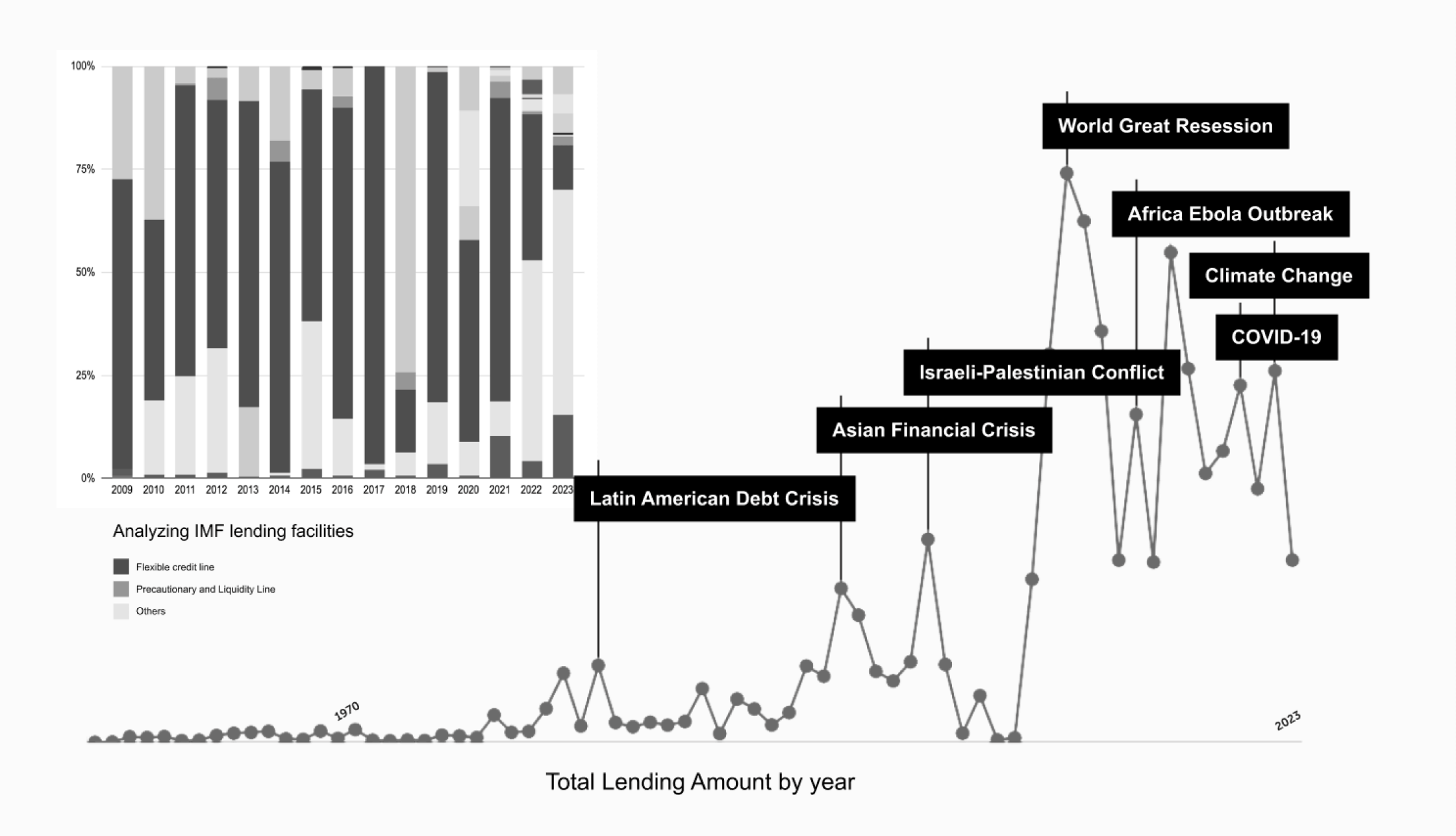
The data provided shows the lending commitments of the IMF since 1952. We categorised and analysed the types of funds involved in the data and at process the dataset using different categories (country, year, fund type) as filtering criteria to gain more diverse insights.
Ultimately, we chose to look at the data in an aggregated manner, calculating the total amount of funds in each year as the underlying data context, while retaining the consideration of new types and special cases to develop a multilinear narrative.

Early sketches and wireframes on interactive maps and glass filter map installation ideas
Early stage proof of concept Figma prototype about yearly lending amount and significant events.
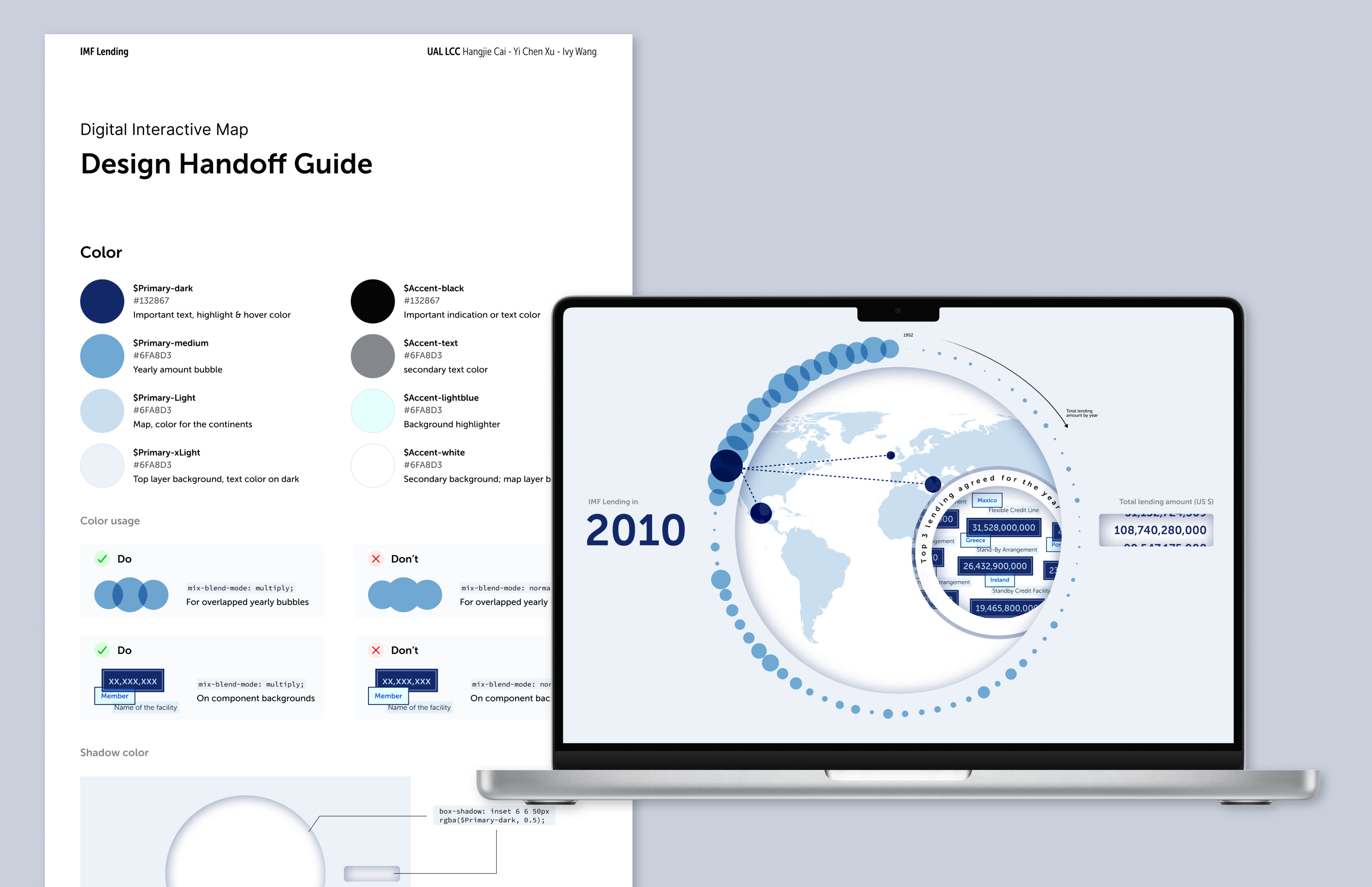
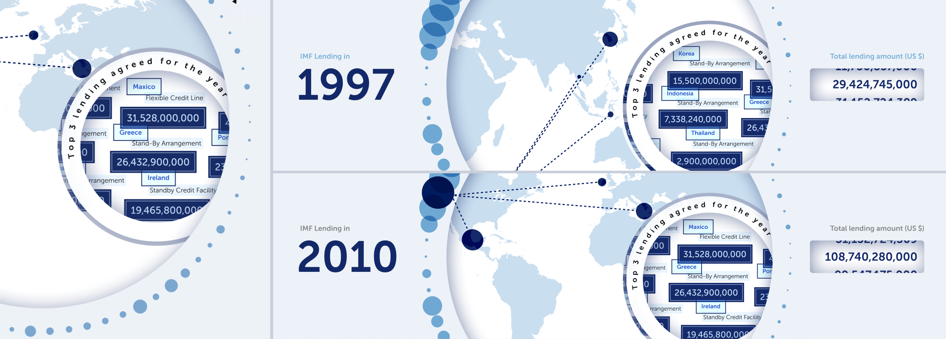
For the first output, our goal is to create a digital interactive map that offers a macro perspective—a high-level overview encompassing the entire dataset's time range and all member countries. Following our established visual direction, we employed multiple layers, circles, and shadows to enhance the presentation. This approach allows us to leverage the extensive period of data not only at a high level but also to include highlighted details that provide deeper insights.
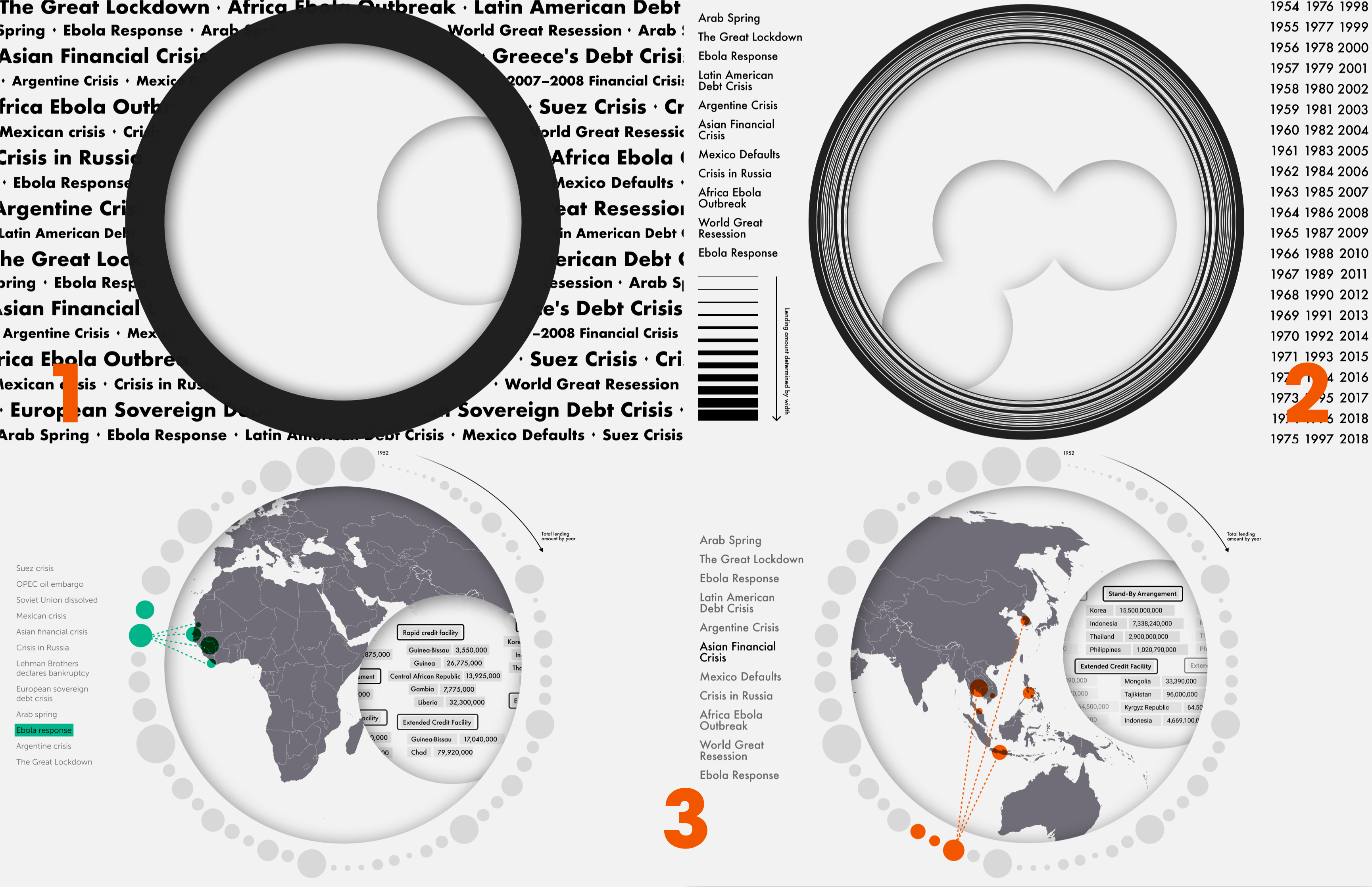
Three iterations refining the visual concept and details.
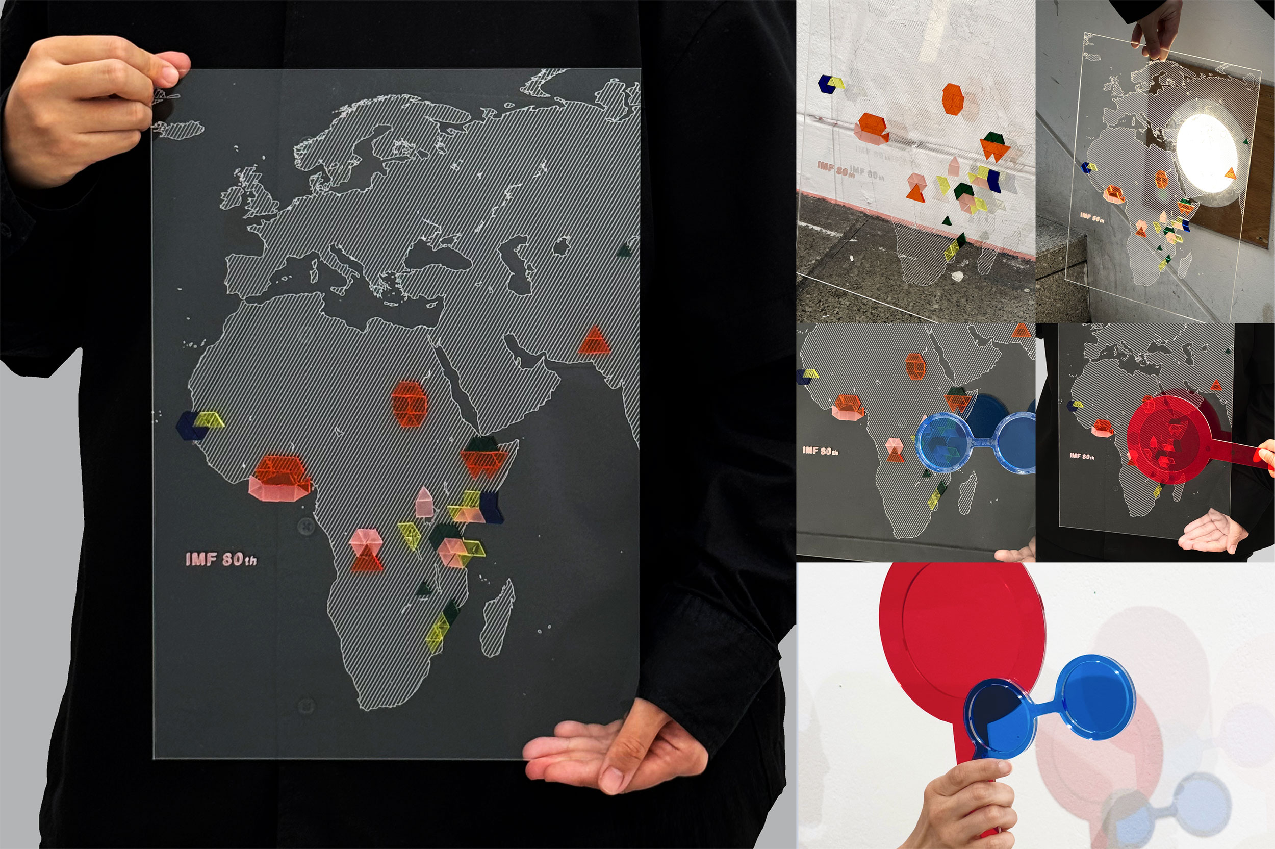
For the second output, we kept our hands busy by selecting the appropriate materials and working hands-on with the laser cutting machine to build a prototype from scratch. This involved a cycle of testing, failing, and reworking. We understood that to develop a feasible installation proposal, we needed to not only model it on paper but also be able to construct it ourselves.
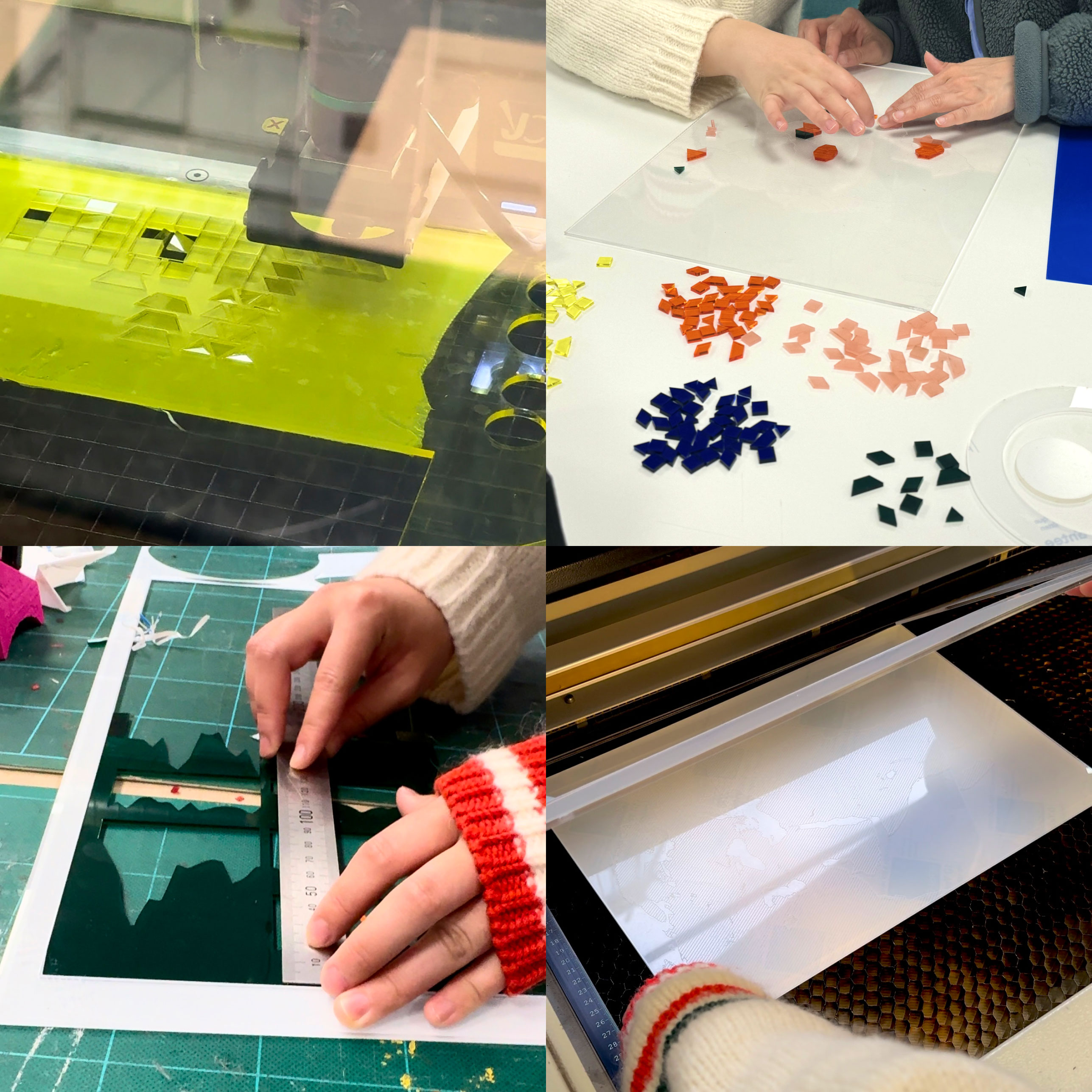
Making process in 3D workshop.
Throughout the process, we conducted a total of four feedback loops with the IMF team. As our iterations progressed, we as a team, carefully adjusted our focus and content based on their feedback and requirements. The document and visualization below demonstrate the details of the first three feedback sessions:
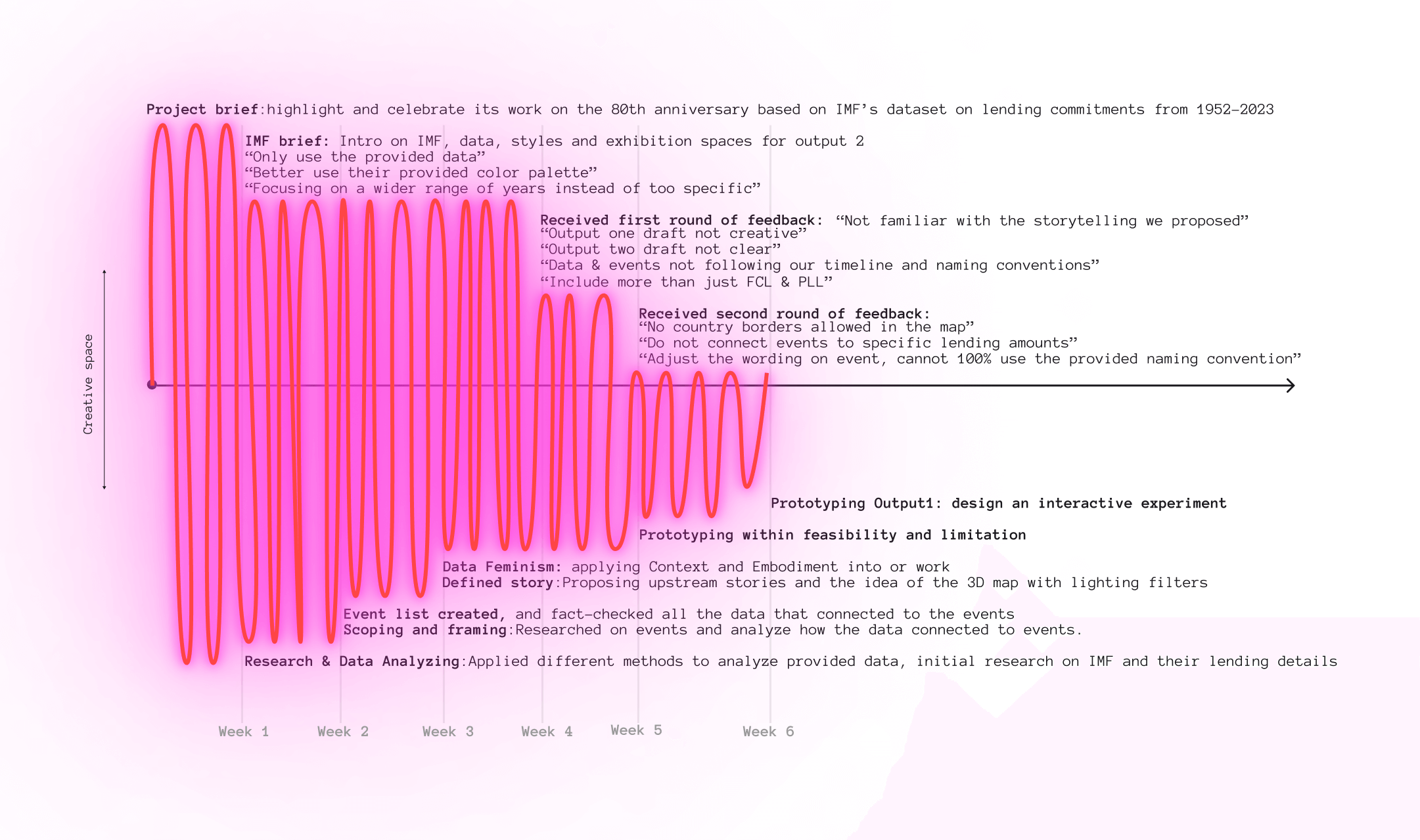
As feedback came in, more requirement details become clear.
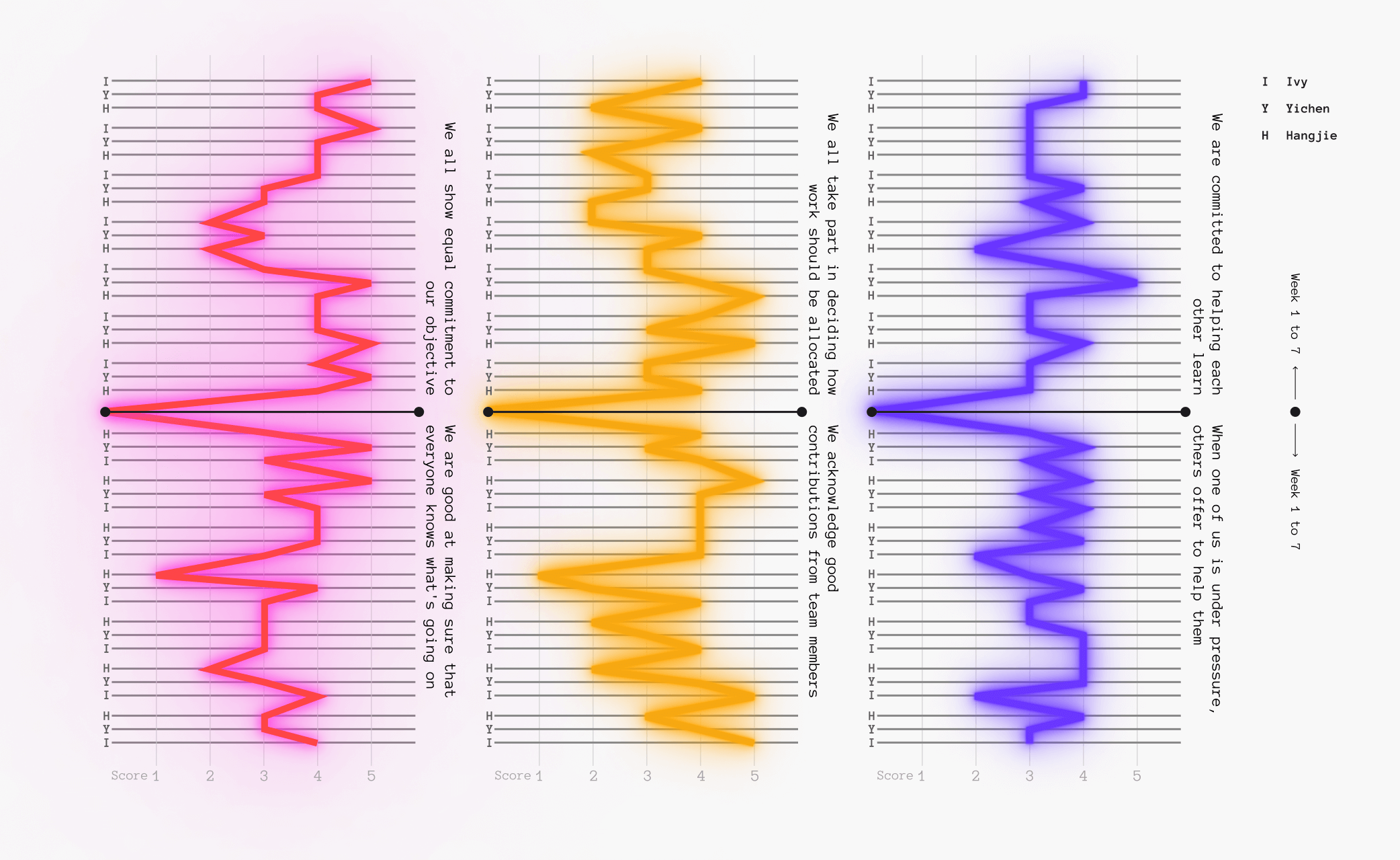
Here is our "Are we a team?" scoresheet, spanning from week 1 to week 7. I've organized it into three pairs of closely related questions. By linking our scores together based on each question, I can easily identify areas of divergence and alignment within the team.
I have delved deeper into our communication styles, identifying two predominant approaches: working individually and engaging in online discussions when necessary, or convening in person at the LCC classroom to collaborate. The chart below illustrates the time allocated to each over the past seven weeks. It's evident that collectively, we have chosen to invest more time working together in person.

As part of a group activity, we tackled a particularly challenging maze individually. At different points, we felt the urge to give up, encountering numerous dead-ends that required patient exploration of alternative routes. Over time, we began assisting one another, efficiently eliminating incorrect paths. With mutual support, we successfully navigated from the Start to the Finish point.
This experience taught me that a key aspect of effective collaboration is not fearing the long journey. Embracing the process together is the most valuable aspect when working with others.

A turning or deviation from the direct road; a roundabout or circuitous way, course, or proceeding.
-- Oxford Dictionary