Design System need not be a huge topic
In recent years, more companies have learned the value of the design system and have put more resources into it. However, there are still many stories shared in the community about how difficult it is to gain buy-in and get the work started. Although everyone has their unique stories and scenarios, I would like to share my experiences and learnings about how to initiate the work.

A manageable scope
A design system offers many things such as a library of visual styles and components; documentation instructing the guidelines and usages; voice and tone; and branding materials. A design system also requires constant maintenance and updates. Lots of resources and time would be required to invest in a system with such a big scope. Gaining buy-in from stakeholders becomes much more difficult if they can’t see the value of the investment.
Fortunately, design systems need not be such a huge topic, and can always start small. Finding the key problems to solve and defining a clear goal could help with a manageable scope.
However, a manageable scope was not my first approach. When I was about to start the design system work, the company had just changed the name and was thinking about a rebranding. So, I jumped to a conclusion that it was a great idea to re-design and re-define the styles of the product.
With my research on the product and the competitors, coupled with experimentations on new styles and visual directions, I then came up with a proposal with a big scope including redesigning the brand & styles, new components, layouts and a detailed documentation with rules and principles.
The proposal was not well-received. Stakeholders who were once excited about building the design system, started to back off when they realized the amount of time, resources and changes required. I also learned that most of the stakeholders were not interested about rebranding and prefer to focus on functionalities of the product.
With the lesson learned, I knew I needed to try a different approach focusing on the product.
Our product was struggling with an inconsistent UI.
The visual direction and the styles of the UI were not consistent. Too many choices added extra complexities. Users had little confidence when using the application, as they were easily confused by it.

Research
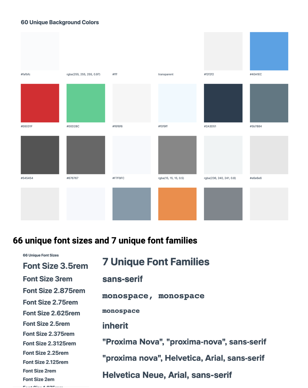
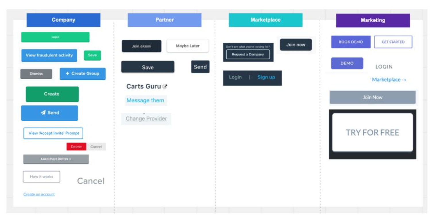
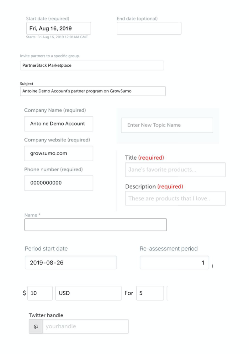
I audited the UI to understand the state of the style and components. I took screenshots from every page of the interface, sorting and categorizing components; mapping out some majority user journeys, and performed high-level usability tests on components. I also ran health checks of the legacy stylesheet, for identifing and analyzing the global styles and properties.
Our engineering team was spending time making design decisions.
The design process was skipped or rushed to meet the deadline on features and functions. The engineering team was forced to make design decisions while building. As a result, it led to a chronic problem on the legacy codebase including hard coded components that are not scalable, and deprecated styles. Making changes to styles and components became a tedious and time-consuming process.

Research
Often enough on the sprint plan meetings, developers had concerns about the effort and timeline on front-end works. With the fast-paced development circle, I assumed that developers were facing many challenges in building styles. Due to the rushed timeline, a design might not be ready for the team. I wonder developers would make design decisions themselves.
To fact-check the assumptions, and to get a better understanding to help identify the problems, I surveyed the engineering team asking their experience of building styles and components.
Based on a survey I conducted, around 80% of the developers think that too much time was spent on making design decisions. The workflow could be much more efficient and productive if they can focus on building functionality.


Based on the survey results, it’s clear that improving the efficiency of product development can be the biggest win. Building consistent styles and components, and having each of the elements easy to access, search and reuse.
Achieve efficiency with well-structured Design Tokens
Design tokens could help to store tiny design decisions (i.e. the values) of styles, so that could be used as the flexible building blocks for style properties, components and layout.

Design tokens were structured into two tiers: basic tokens and utility tokens. Basic tokens store style information such as color, space and basic typography properties. Each basic design token can only hold a single value. The basic tokens formed the scope and availability of the global styles and elements.
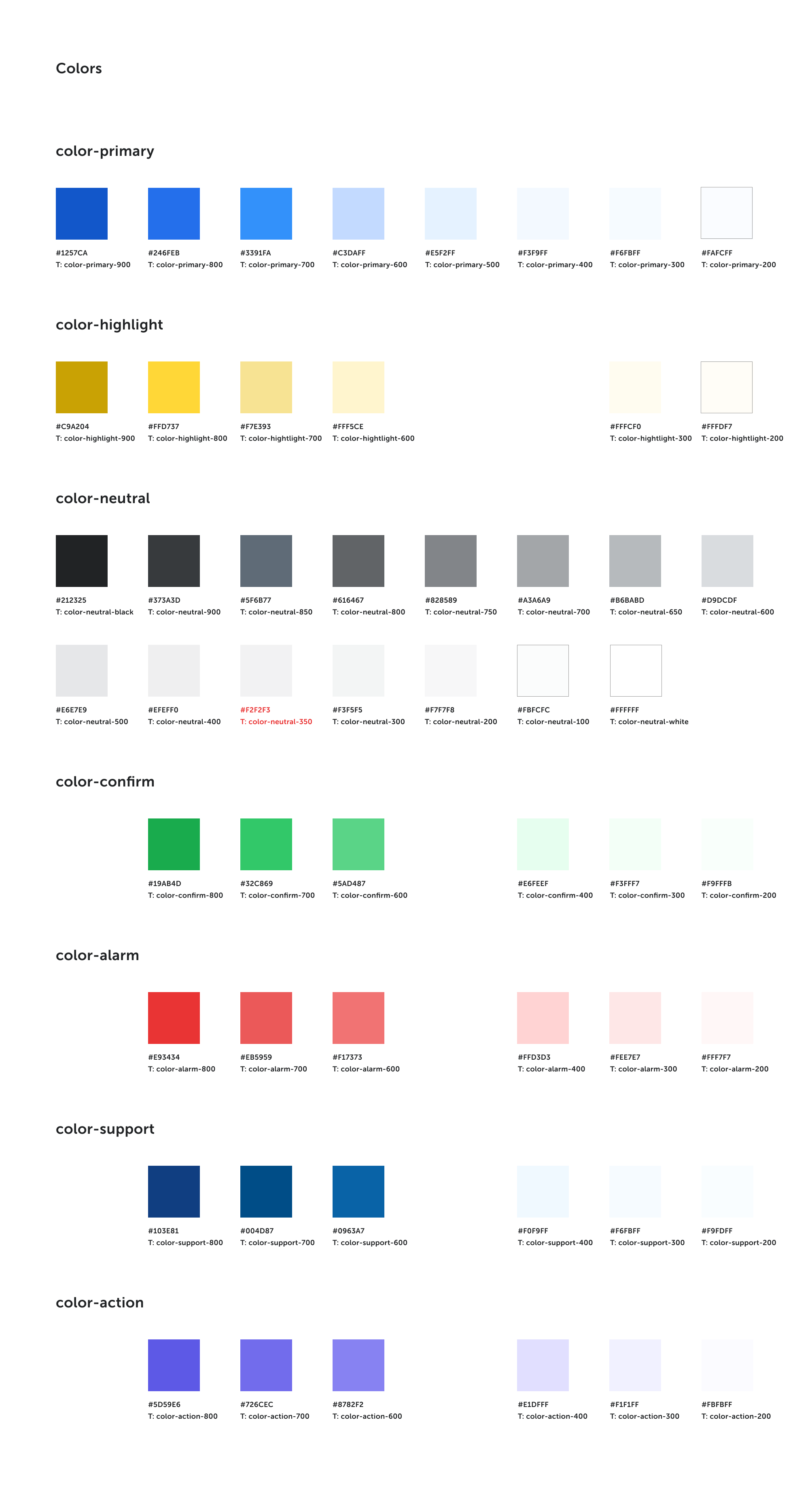


I built utility tokens for the purpose of storing small units of design decisions. Built with basic tokens, utility tokens were designed to describe the design intent and the usage.
As an example, “color-primary-800” was a basic token that stores a value of a blue color. However, from the name, a developer might not know when and how to use it, because it did not provide enough information to tell the design intention. On the other hand, “color-background-button-base” was a utility token that shared the same value as “color-primary-800”, and could provide much more information on design intention.
I’ve worked closely with our engineering team, experimenting with different ways of structuring and organizing the utility tokens. I learned that having a systematic and clear naming system could establish much more informative design decisions.

Working with engineering team
Before designing utility tokens, developers were using a well-known CSS framework. The framework has an out-of-the-box library of styles and can be applied by using HTML class names. The Developers were familiar with its naming convention but had many problems with it.
I conducted one on one interviews with each developer, understanding their opinions of the naming conventions. Because the existing framework provided a good familiarity to most developers, I used it as a starting point to experiment with ideas to improve the namings. Then, I had the team discuss and vote on each idea.
I work-shadowed on developers to observe how they style the UI. Because the existing namings were not consistent and systematic, the team spend lots of time guessing the name based on their memory, trying one after another until they find the right one.
Self-explanatory
With the utility naming, developers could know where and what to apply with very limited guidance. To achieve this, the design decision needed to be clearly identifiable in the name by using intuitive and easy-to-relate verbiage to describe the styles and properties.
Consistent structure and syntax
The structure of naming needed to be standardized and well-communicated to the team. An inconsistent structure can cause errors or the meanings to be changed.

Using short-form wisely
While short-form could be time-saving, the full form of the word could better communicate the information. In a common use case: developers would want to search and pick the right one for their tasks. Having the full form of the word to name a token would be easier to search. Consider “color-border-button-base” vs “color-br-bt-b”, the latter could have different meanings for different people, resulting in a higher risk of human errors and confusion.

Example - Short-form & Full form
bg is a short-form for the word background (full form).
The full form worked better to communicate the information. However, as developers got more familiar with the system, we started to introduce short-forms on selected words to increase efficiency.
To do that, I first collected feedback from the team and we together decided on what can be added to a short-form list. I wanted to be careful not to add too many to easily be confused by each other. As the list was getting bigger, I started to see a pattern, that most of the short-forms on the list were for long words, or words that were relatively tricky to spell.

Example - In the short-form list
bg for background, ph for placeholder, hl for highlighter
Starting with the fundamental components
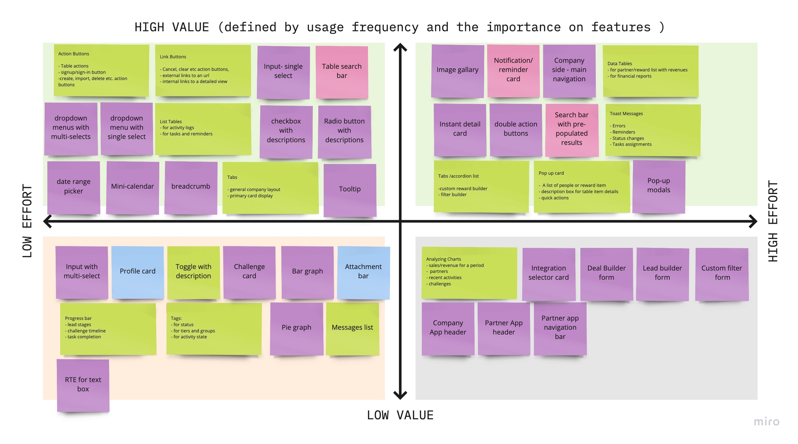
To start small, I wanted to have a better understanding of the components we already have. I first audited the UI of the product, sorting and categorizing components. I then invited our engineering team to contribute their knowledge about the feasibility and usages of components. Along with the data collected from the product team and the customers, I was able to define a set of key components to start with.
Deploy the system as soon as possible
I once fell into a line of thinking about having most of the components designed and developed in one shot. However, this waterfall methodology had a long turnover time and less space for iterating components given that the product was growing fast with new features and functions every week.
A long timeline also resulted in not being able to deliver values incrementally. People were waiting and couldn't see the results.
I learned that I could not wait until most of the components were designed and built. Having the system in use sooner is critical to keep the design system work persistent.
By the time we built half of the fundamental components along with the design tokens required for these components, engineers had started using them in their product development. To encourage the usage, I included descriptions about tokens and components in handoff files.
In case a component was in the design file, but not yet ready in the design system. I encouraged developers to build the component using the available tokens, which can later be reviewed and finalized by the design system team.


Documenting on the go
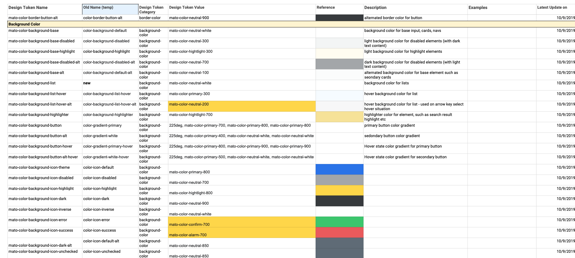
During the process of building the components and tokens, I struggled to document everything in one location where both designers and developers can use it as a single source of truth. Adding extra notes in the hand-offs was great and helpful, but extensive documentation was needed and could not be replaced. The team needed a place to search, filter and learn the system that stores all the up-to-date tokens and components.
The documentation seemed to be much more crucial when the designing, building, testing and delivering to production all happened at the same time. More urgent tasks need better alignment and communications to guide people through.
Given the challenges of resources, time, and limited budgets, we decided to use excel sheets for our temporary documentation needs. It was not an ideal long-term solution, but it solved the problem and saved us the time to focus on building more tokens and components. With the excel sheet, the tokens, components could be put in one place where everyone can access, search and filter.

Meanwhile, I collected feedback while building. I interviewed with developers regarding their experience with the tokens and components; I created the form for developers and other teams to log issues, problems, and improvement suggestions on components.

The results
- The Engineering team spent less time making design decisions when more tokens and components were added to the system. The efficiency of product development has improved.
I used to go through many codes to find the styles of a component, I ended up finding three versions of them and did not know which one to use. Now, it takes a few seconds to find it.
A front-end developerI once thought that some names of the tokens are too long, but as soon as I got familiar to it, I found them intuitive to use. The best part is I don't need to spend time on wondering which color or font-size to be used anymore.
A front-end developer - Thanks to the utility tokens, style changes became easier. Previously, making a small style update like a color change was time-consuming. Making one change might also mistakenly change other unrelated styles. However, with the utility tokens, updating styles could be as easy as updating a CSS variable, providing a much more efficient workflow for product development.
- A cohesive UI started to form. Refactoring and updating the legacy CSS file took time. So we started with simple components such as buttons and inputs first, and slowly expanded the process of refactoring.

- With a manageable scope and a flexible and agile process, I can start small without much resources. Focusing on baby steps helped me gain more trust from the team along the way. After working solo for a few months, I was able to form a team of three to build more tokens and components; and continued on refactoring the legacy stylesheets.
